
Why Kelvin Matters in Architecture


Why Kelvin Matters in Architecture
By James Russ
When architects think about lighting, the conversation often centres on lumens, beam angles and fixture design. Yet one of the most influential decisions is often one of the simplest—the colour temperature of the light.
Measured in Kelvin (K), colour temperature has a profound impact on how people experience architecture. It influences the appearance of natural materials, affects mood, and ultimately determines whether a space feels inviting, clinical, dramatic or calm.
As a general guide:
2200K–2700K creates a warm, intimate atmosphere and complements timber, stone and natural finishes.
3000K offers a balance between warmth and clarity, making it suitable for many residential and hospitality projects.
3500K–4000K provides a cleaner, more neutral light often used in commercial environments where visual accuracy is important.
5000K and above closely resembles daylight and is generally best reserved for specialised working environments rather than living spaces.
The mistake I see most often is choosing a Kelvin rating based on brightness rather than atmosphere. A beautifully designed interior can lose its warmth when illuminated with light that is too cool. Likewise, carefully selected natural materials deserve a colour temperature that enhances their texture rather than flattening it.
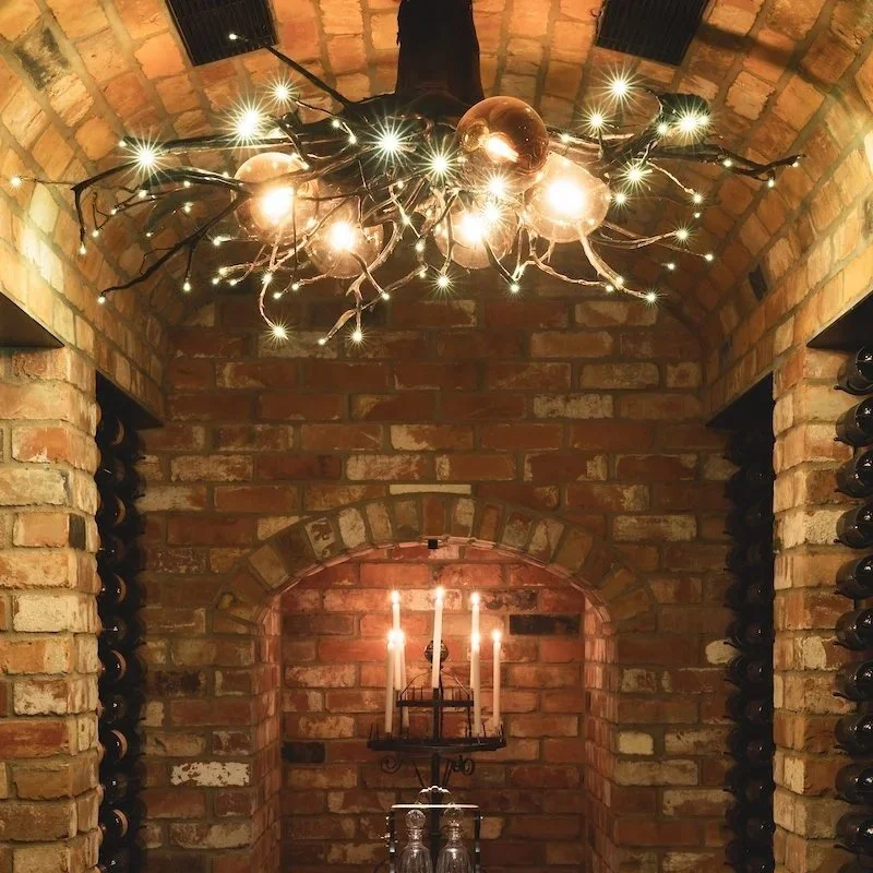
Throughout my work, I have treated light as an architectural material rather than simply a source of illumination. Projects such as Hei Matau, Magnolia, and Tantalus Estate demonstrate how carefully selected warm white LED lighting can enhance brass, timber, stone and glass, creating spaces that feel both functional and emotionally engaging. Likewise, the Infinity Pendant was designed around the belief that light should complement natural materials with a soft, timeless glow rather than overpower them.
For emerging architects, my advice is simple:
Choose your Kelvin rating as early as you choose your materials. Lighting should never be the final decision—it should be part of the architectural concept from the beginning. The right colour temperature won't simply light a room; it will define how that space is remembered.
Good architecture is seen. Great architecture is felt. Light is often the difference.
Just send me an email if you’d like some expert advice for your next project.